Top ten things you can do to improve your art.
- Doug Swinton

- Jan 19, 2021
- 8 min read
Updated: Mar 15, 2021
Nothing wrong with being a weekend painter or just being curative in the kitchen but if you want to take your art up a flight of stairs to the next level here are some ideas that will help get you there.
#1 Having a proper studio and an inviting work environment.
As I said, pulling out all your art supplies, putting down some plastic and setting up your easel at the kitchen table is fine for Sunday painters. If you want to get better, get a real studio. It doesn’t have to be big or even fancy but you need to create an environment that will help you create.
This may seem obvious, but we are a product of our environment. if your environment is dark, cluttered, dusty, cramped or messy, how can you create and improve your art? You cannot perform and create at your best when you are uncomfortable or claustrophobic.
If you have a studio, Clean, organize and unclutter your environment. At the end of each workday you should, also, clean, organize and unclutter so you are ready to focus on your art for the next session. Keep your equipment clean, easel, desk, workspaces. Wash your paintbrushes; organize loose papers, books and other materials.
In his most excellent book “The War of Art” Steven Pressfield writes, The professional wants the floors swept and the carpets vacuumed so the Muse may enter and not soil her gown.
#2 Have a Concept in Mind Before You Begin
All expressions of art begin with an idea, a concept if you will. A concept is an idea formed in the mind, which will help the artist express how something will be accomplished. In order to improve your art, it is best to have an idea of what the finished piece of art may look like. Envision what you are trying to create and you will surprisingly get closer to it.
Be it in your mind or even in your sketchbook, an artist without a concept is like a traveller without a roadmap. That does not mean that you have to be rigid in your creating. You can allow for artistic inspiration to guide you, but by keeping that concept in mind you will start off on the right road to artistic freedom.
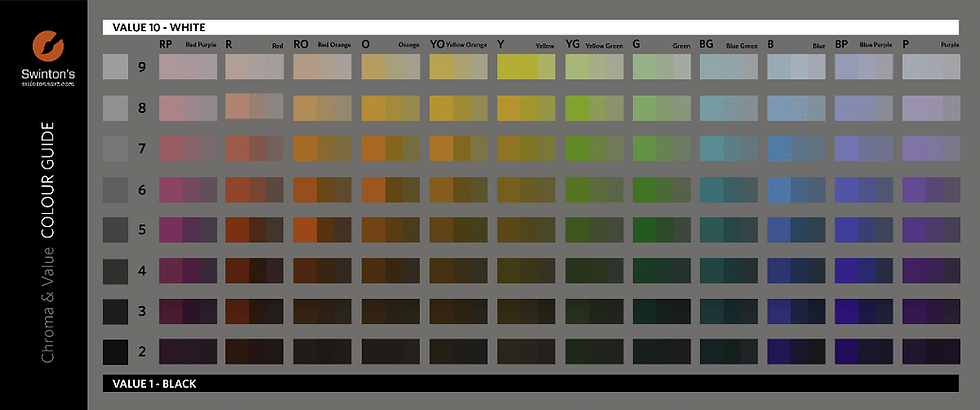
#3 Learn to See Value
Value or tone is how light or dark that colour is. For example: If you took a black and white photograph of your painting, the shades of grey would be the different value or tone within the painting.

Believe it or not, value is more important than colour to the design and success of a painting. Value is used to create a focal point within a painting or drawing because the human eye is immediately drawn to a light element against a dark element. This creates, the focal point of interest. To create the illusion of depth, gradations of value are also used. Areas of light and dark give a three-dimensional illusion of form to the subject matter. Remember “colour gets all the credit but value does all the work.”

Greely Pass colour

Greely Pass in tone
#4 Get to know your colour bias
Here is a little secret just for you (don’t tell anyone) The secret to good colour mixing is knowing your colours bias. Each colour may be its own colour but it has an underlying bias.
What does that mean…. We if you look at the colour chart above you will see the six colours we use each time we paint. Red, yellow, blue, orange, green, purple. You will also see that each one of these colours has a cousin (or bias) on either side. Let’s look at our old friend yellow. Great colour for warm fun fall trees or California skin tones but also good for cool spring greens and painting lemons in a bowl. Here’s the hitch. Yellow isn’t just yellow. Each tube has a bias. It’s a cousin.
If you again look at the colour chart you can see to the left of the yellow is yellow/orange. If we look to the right we see yellow/green the cooler version. The side colours are the colour's bias.
What does all this mean? Each tube of colour you buy, each pastel you use will have a bias to one colour side or the other. You need to draw down or water down the colour and you will see its bias. Alizarine Crimson that is drawdown has a very blue tendency.
This means it’s good for making cool reds like a shadow side of a barn. If you draw down Cadmium Red Light you will see it has a bias of orange in it which makes it good for making warm red colours like skin tones.
Once you learn all your colours bias then you can mix to that bias for cleaner mixes. For example- if you want a nice spring green just mix blue and yellow. Ultra Blue and Hansa Yellow will give you green but it will be a moderate to duller dark green. Why? Ultramarine Blue has a red bias in it and as we know red and green are opposite colours and make grey. This greying effect is what makes the dull green. We choose a different blue like Manganese Blue and a Hansa Yellow we get an eye-popping fish green. Why? Manganese Blue has a green bias and wants to go to the green side. Choose colours that lean toward the colour you’re trying to make and you will get cleaner fresher mixes.
#5 Understand Cool and Warm Colors
Leopards can change their spots. Warm isn’t always warm. We all know the warm colours are red, yellow and orange. We also know the cool colours are blue-green and purple. So blue is a cool colour. Ultramarine is a cool blue. Manganese blue is a cool blue. When ultramarine blue is placed next to manganese blue the ultramarine blue is warm. Wait… what… you just said a warm blue…. how can that be….you said blue is a cool colour. Well as I said in the opening, a leopard can change its spots. A colour's temperature cannot be decided until it’s has another colour placed next to it. Placing warm and cool colours next to each other is what gives painting the zip you're looking for. Learn to gauge your colours temperature and you will get some winning paintings.
Facts about Cool colours
Cool colours based on blue undertones bring to mind a calming effect. These colours range from cold icy blues to warm and nurturing Mediterranean turquoises. Many decorators use these colours in spas, bathrooms and other quiet environments. Blues lower heart rate and reduces appetite. Blue represents dependability. It is commonly worn in uniforms and business suits. Dark blue is generally used by more authoritative figures including police officers and our Presidents! Blue and greens are used in advertising medicines and health care products. ‘Greenrooms’ of theatres are so-called because their green walls are often used to steady the nerves of actors. Dark greens do well in offices and studies. Yellow greens denote sickness and bad health. Look at our old friend Scar from the lion king. He is drawn yellow-green to look evil and sickly.

And never ever paint a bathroom green. People will think they look terrible and maybe getting sick.
Facts about Warm colours
Warm colours are based on yellow-orange undertones and tend to convey emotions ranging from happiness to violence. Red, orange and yellow colours trigger hunger. This is why you see restaurants like McDonald's, Wendy’s and Burger King using these colours in their logos and advertising. Safeway, Canadian tire and Costco all use red in their logos. Red instantly attracts, makes people excited and increases the heart rate. Just think of Coke and Red Bull!
#6 Composition
This is such a complicated and important subject that it seems daunting to condense it down into a bullet point! But, I will give it a try… The composition of your art is the arrangement and placement of visual elements. There are numerous compositional techniques to help you achieve unity and aesthetically pleasing artwork. That said, some artists such as Salvador Dali and Pablo Picasso chose to ignore traditional compositional approaches to challenge the viewer! Here is one timeless tool, to help you develop pleasing compositions for your art and design.

The rule of thirds is often overlooked by amateur artists and forgotten by many art teachers. Interestingly, it is one of the most important rules that a novice photographer learns about in photography class! This ‘rule’ or guideline is commonly used in the visual arts community today including painting, photography and design. Using it will help improve the design of your art.
The Rule of Thirds is probably one of the most basic rules that have been used in painting for ages. It is a compositional rule of thumb that is commonly used in the visual arts today including painting, photography and design.
Here is how the Rule of Thirds works:
Draw two equally-space vertical lines
Draw two equally-spaced horizontal lines
It looks like a tic-tac-toe board
This divides your rectangle or square canvas into nine equal parts
This creates four points where the lines intersect or ‘hot-spots’ or ‘sweet-spots’
Studies show that placing objects in these intersections create a pleasing composition
Balance in the design can often be achieved by placing a secondary object or counterpoint at the opposing intersection.
This creates more interest, tension and energy rather than just centring the subject
Applying the rule of thirds to a painting keeps your composition from being split in half either vertically or horizontally
This avoids the main focus from the centre of the painting like a bull’s-eye. The Rule of Thirds is actually a guideline more than a rule. It is intended to help the artist with the placement of the elements and focal point within the composition. however, if you want your viewer to ignore the other parts of your painting, then go ahead break a rule and centre your subject like a big bull’s-eye! Knowing why you do something and what effect will have on the viewer leads to a good composition.
#7 Learn to See the Negative Shapes of Space
As humans, we are so conditioned to focus on the object in front of us. As artists, it is important to see the spaces between and around these objects. These spaces are important and hold relative location and proportions that do not exist in the objects themselves. Learning to see and draw the shapes between the lines that make up an object will help you correctly render your subject.

Shapes are just as important as the shoe of the dancer. In fact, if you get the negative shapes right then the proportion of the dancer will be right. This way, you are drawing what you see and not what you know.


Try not to see as much of the subject but the shapes around the subject. If you can focus on painting or drawing the black shapes rather than always painting the white shapes you'll get more accurate proportions.
#8 Keep it Simple
Paintings or images with too much information clutter and distract the viewer and make it difficult to identify the subject. The strongest works of art, edit the extraneous content, which allows the viewer to focus on the primary objects. Remember kiddies…less really is more.
#9 Use Rhythm
Rhythm in art is created whenever movements flow into a repeated pattern. Rhythmic patterns can be found in photography, glass art, ceramics, sculpture, realism, abstract art and more. Rhythm can strategically be used to move the viewer’s eye throughout the work of art. Colour patterns, light patterns, texture and application of paint can all be used to create and convey rhythm and energy to the art. I find that listening to music while I create helps me express rhythm. My paintbrushes dance across my canvas!

Here in this painting of a model, you can see the repeating lines I used to produce a sense of rhythm. Rhythmic lines can even be in the background!


Lots of rhythm in mountains.

#10 Determination
Dedication, determination and a desire to improve are important factors to the success of any artist. Each artist progresses at his or her own pace. Be patient with yourself and celebrate your artistic improvements and achievements. Be nice to yourself and pat yourself on the back. One of the things that I love most about painting is that it is an activity we can improve upon with age, unlike many other enjoyable things we experience in our youth. As long as we have our faculties, determination and the desire to improve our art we can continue to excel and grow as artists.
Bonus: #11 Commitment
With the success of any artist comes one thing they have in common. Commitment. The road to success has many bumps in it and it isn't always laid out for you. Lots of times you have to make your own path. Lots of times you will be faced with obstacles that will make you want to quit or divert from the main objective. Ultimately, the ones who are committed will figure out a solution and move forward no matter what they are faced with. The ones who are half-committed will usually change their mind and lose focus on the final destination.
Your friend in art, Doug.


monero miners monero miners
monero miners monero miners
monero miners monero miners
monero miners monero miners
monero miners monero miners
monero miners monero miners
etc mining etc mining
monero miners monero miners
monero miners monero miners
monero miners monero miners
monero miners monero miners
monero miners monero miners
monero miners monero miners
etc mining etc mining
monero miners monero miners
monero miners monero miners
monero miners monero miners
monero miners monero miners
monero miners monero miners
monero miners monero miners
etc mining etc mining
monero miners monero miners
monero miners monero miners
monero miners monero miners
monero miners monero miners
monero miners monero miners
monero miners monero miners
etc mining etc mining
monero miners monero miners
monero miners monero miners
monero miners monero miners
monero miners monero miners
monero miners monero miners
monero miners monero miners
etc mining etc mining