


The Art of Attraction: How Carter Brown's Covers Pull You In

There was always a book lying around the house — usually open, usually being read, and quite possibly being used to keep a chair from rocking.
My mother tended to read books with a little more depth and literary sophistication. My father, an engineer and geologist, leaned toward the lighter, more entertaining fare.
Ships at sea. Adventures. Mysteries. Anything involving a good story and preferably something going terribly wrong.
Captain Horatio Hornblower — or, as I used to call him, Captain Harry Horswaggler — was right up his alley. So were James Herriot’s stories about being a veterinarian in the Yorkshire Dales.
My dad was almost always carrying a book.
When he passed away and we started cleaning out his library, I discovered something that was very "Dad".
He had kept every book he had ever read.
My mother, on the other hand, would read a book and then give it away for someone else to enjoy.
Dad didn’t believe in that sort of nonsense that books could be read two or three times. He was building a library.
And as we started to dump the shelves, I began noticing something
There were probably 50 or 60 detective and crime paperbacks, most of them from the 1960s and ’70s.
They all had the same “Hello, nurse!” alluring pattern. That pose, those colours and the loose backgrounds …
I stopped.
I thought that looked like a Robert McGinnis painting.
And sure enough, there were more.
And more.
I counted at least twenty covers by McGinnis alone.
Ironically, I recognized his work because I’d recently read a book about Robert McGinnis, so suddenly I’m standing in my father’s library looking at these old paperbacks in a completely different way.
What I had previously thought of as simply old detective novels with sexy women on the covers suddenly became a fascinating little history lesson in commercial illustration and composition.
So I thought I’d give you a brief history of this genre — and a mini lesson on why I think it’s so dang cool.
The Carter Brown connection.
Carter Brown was the pen name of Australian writer Alan Geoffrey Yates, who wrote hundreds of crime novels.
But the books became almost as famous for their covers as for the stories inside them.
Robert McGinnis painted roughly 100 covers for the Carter Brown series.
And here’s the thing I love about them:
Look at the composition.
McGinnis understood that a paperback cover had to work from several feet away on a spinner rack.
Which, frankly, is a pretty good rule for any painting.
If it doesn’t grab you from six feet away, maybe you’ve got some explaining to do.
I like to think that all paintings should do that anyway.
Maybe I’m an illustrator at heart.
I just can’t draw.
McGinnis doesn’t give you a complicated scene with twelve things all screaming, Look at me!
He gives you a dominant shape.
Usually it’s the woman.
She might be:
● leaning diagonally across the picture
● twisting into an S-curve
● looking directly at us
● dramatically cropped by the edge
● surrounded by a large area of relatively simple colour
● contrasted against a dark background
Design before detail.
And notice how often the figure isn’t sitting politely in the middle of the painting.
She’s off-centre.
That creates movement.
The diagonal
This is one of the things I think painters can really learn from McGinnis.
Draw a line through one of his figures, and you will often find a strong diagonal rather than a boring vertical or horizontal pose.
That diagonal immediately gives the painting energy.
Then he’ll counter it with another shape — a door frame, a shadow, a piece of furniture, a man’s arm, a gun, a staircase.
So you’ve got something like:
Dominant diagonal → counter-diagonal → focal point.
That’s whack-a-doodle of a good design.
He knew where to put the darks
This is another reason these paintings work so well.
The background might be almost nothing.
But he’ll put a big dark shape behind the face or body.
Suddenly, the light figure pops.
It’s basically the old painter’s trick:
Don’t make everything interesting. Make the important thing interesting and back off on everything else.
Or, as I like to call it:
Give the viewer somewhere to rest before you hit them again.
And then there’s the formula
The formula was almost cinematic:
● beautiful woman
● danger or mystery
● strong gesture or pose
● dramatic lighting
● saturated colour
● a hint of sex
● often a gun, knife, cigarette, car or shadow, something dangerous.
● and a title large enough to read from several feet away
The painting wasn’t merely illustrating the story.
It was selling the fantasy of the story.
And that’s what makes these covers so fascinating.
You haven’t read one word of the book, but the painting has already told you:
Something is going on here. And you probably want to know what.
And then there’s the McGinnis woman.
The famous McGinnis woman isn’t simply a pretty model.
She’s elongated, elegant, intelligent and slightly mysterious.
McGinnis often worked from photographs of models, but he didn’t simply copy what he saw. He altered proportions and forms to create that unmistakable McGinnis ideal.
The result is a woman who looks almost too elegant to actually be involved in whatever terrible thing is about to happen.
Which, of course, is precisely the point.
But here’s the really interesting part for a painter.
McGinnis wasn’t just painting a woman. He was painting the idea of the book.
If the title suggested danger, he gave you danger.
If it suggested exotic locations, he gave you an exotic location.
If it suggested murder, sex, mystery, or adventure… Well, he had all those bases covered.
The entire thing had to work in a tiny rectangle:
image + composition + colour + typography + story + sex + danger + mystery.
And somehow he made all of it work together.
And then there’s Dad’s library.
As I photographed these covers, I couldn’t help thinking:
I really should have kept them.
I could have done a Holly McWilliams and collaged a whole bunch of them together into a painting.
Imagine a big painting made up of all those ridiculous, beautiful, wonderfully over-the-top covers.
Dad’s reading history turned into a painting.
Now that would have been a pretty cool tribute.
Instead, I took pictures.
Because apparently I’m a painter who sometimes has very good ideas about five minutes after the opportunity has disappeared.


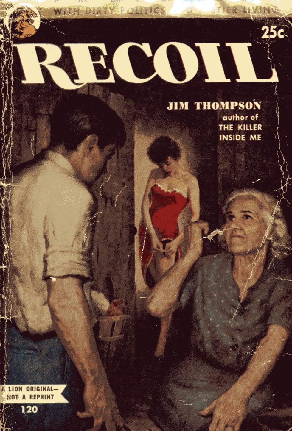


So that’s my little rabbit hole into Carter Brown, Robert McGinnis, and the wonderful world of pulp paperback cover art.
What started as cleaning out my father’s library turned into a lesson in composition.
And a reminder that sometimes you can learn a hell of a lot about painting from something that was never intended to hang in a gallery.
It was intended to sit on a spinner rack…
and make some guy walking past stop and say,
“Well, that looks interesting.”
So that’s my little rabbit hole into Carter Brown, Robert McGinnis, and the wonderful world of pulp paperback cover art.
Pulp fiction covers are still a trendy thing. Here are some contemporary artists and their take on it.


Keep these brushes and tablets swinging.
Your friend in art,
Doug.
Just a couple more Robert mini paintings.


Comments