The Magic of the 70/30 Split
- Doug Swinton
- Oct 10, 2018
- 2 min read
Updated: Mar 21, 2021
Using opposites to create a dynamic painting.

Good painting is all about opposites. Warm vs.cool, big vs. small, colourful vs. dull, etc. When we use opposites in our work, they play off of each other to create dynamic excitement and heighten the visual appeal.
Warm colours allow cool colours to sing. Big shapes concede to the small shapes, allowing them to dance joyfully. Colours burst when placed in a sea of grey.
The key is to avoid using the same amount of opposition. When you split the opposites into equal parts you negate the effect.
Let’s go down the rabbit hole and explore how all of this works…
You achieve the desired impact only by using a large amount of one effect and a much smaller amount of the opposite. Anything less than 70/30 and you’re in danger of falling into the Black Hole of Boring.
Breaking a composition down to 50/50, say half shadows and half sunlight, is mundane. Even 60/40 is too close. Avoid! The larger the proportion differential, say 80/20 or oven 90/10, the more eye popping.
Here are a few examples:
In this painting, Lori Putnam is using the light versus shadow opposition. Notice how much light she has placed in comparison to the shadow. 70% of this painting is in light and just 30% is in dark.

Lori Putnam Demo at Swinton's
This Randy Sexton’s painting shows the opposition of large shapes versus small shapes. 70% of the painting is large shapes and 30% is small shapes (details of the scooters.) If this composition was divided into 50/50 of each, the viewer would not know where to look and the painting would become rather boring. It’s not only the use of opposites that works but the differing amount of opposites that gives this painting zip.

Randall Sexton Workshop & Demo at Swinton's
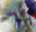
In this selfie pastel by Harley Brown he uses warm cool opposition. Using 70% cool colours and 30% warm colours, he gets the colours to pop. It’s the small amount of warms that makes the cools come to life. I invite you to cover up that little hit of red on the right and watch how the painting falls apart.
In this beautiful painting, Ingrid Christensen has about 90% painting and 10% drawing. She has used a little bit of line in opposition to the brushwork to accentuate or outline some of the painterly areas in this work.

This can be used to your advantage the other way around as well. As opposed to Ingrid’s 90% painting 10% drawing in this work I used 90% drawing and 10% painting.

Here we see the king Richard Schmid using his patented brushy vs. detail method. 30% detail sharply stands out against the 70% loose brushwork surrounding it.

Just about anything you put on your canvas can have an opposite to enhance the effect:
Light vs. Dark
Bright vs. Dull
Warm vs. Cool
Big vs. Small
Loose vs. Tight
Hard Edged vs. Soft Edged
Scribbly vs. Rendered
Blocked In vs. Painted
Red vs. Green
Finished vs. Unfinished
Man Made vs. Natural
Bouffant vs. Square
The trick is to use differing amounts of opposition.
I hope you will use this principal in your next attempt and make your painting come alive.
Happy Arting. :)
Your friend in art,
Doug.