Harmony in Art.
- Doug Swinton

- Aug 9, 2021
- 5 min read
See, the full meal deal is; You want to have a funky painting with lots of eye-popping creativity, and yet you want harmony in there too. How do you achieve this without your work being disjointed? What you are trying to do in your painting is achieve variety and still have a balance at the same time. This is generally known as asymmetrical balance. There are many paths to achieving this but here are a few sure-fire ones to get you on the level.
Balance:
Picture 1 is symmetrically balanced.
Picture 2 is also balanced but in a more interesting way. This is an asymmetrical balance. This is where we want to head.
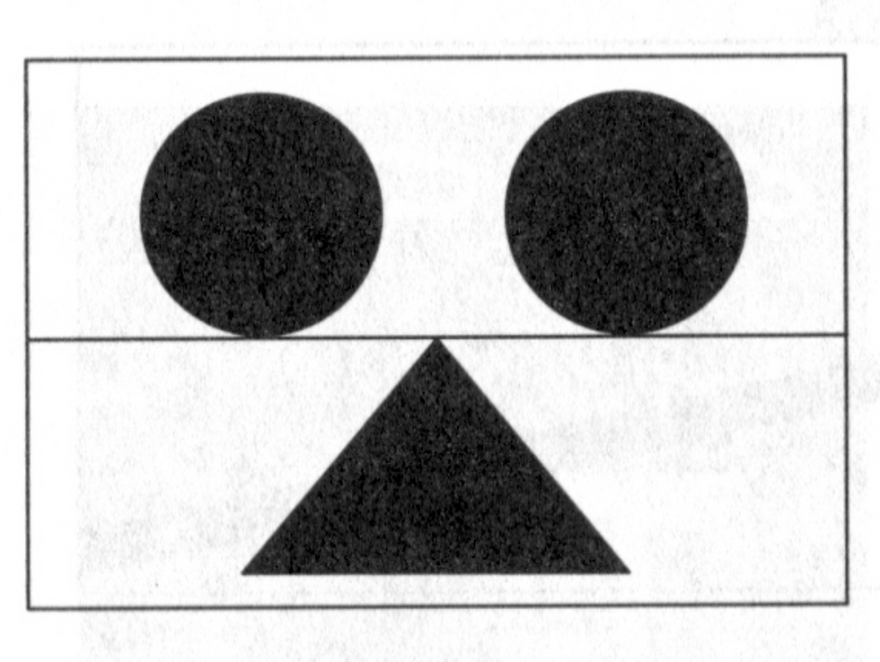
Picture #1

Picture #2
Underpainting:
One of the fastest ways to get HARMONY (alias UNITY) in a painting is to use an underpainting or preliminary wash. Putting one unifying colour down, to begin with, and allowing that wash to peep through in small areas brings a real sense of harmony to a work. If you want the painting to be sensitive, use a wash of something similar to the overall sense of the piece. If you want the painting to be loud and proud, use a colour that is opposite to the overall painting for a little pop and zip! For example, if you want a quiet pastoral scene, the use of a blue wash will create a calming effect and bring a balanced sense of calm throughout. If you’re doing a mostly green tree painting and you want it to sing from the top of the hill, use a rose-coloured wash to start. This will give an overall zippiness to the work. Painting monochromatically can hit the mark in getting balance in a painting. Sticking to basically one colour in a work will help you achieve harmony. This Carol Marine painting is all about red. Everything in this smashing piece has a degree of red in it.

We have variety in the brush strokes, variety in the apple size, variety in the foreground, middle-ground and background yet we have harmony in the thread of red that runs throughout.
Using a “mother colour” creates harmony. You can achieve this by selecting one dominant colour that runs through the painting and using that main colour in all the other colours. This is generally produced by ‘puddle painting’. Making a large puddle of a dominant colour, and then mixing all the other colours using the main puddle colour as a base and all other colours as off-shoots from this puddle will help achieve harmony in your work.

This Sargent work was painted primarily from one main colour - a blue-grey. All the other colours came from that main colour.

The purples, yellow and greens here are all made from the same initial puddle of colour.

Expanding from the central dark, all the colours in this painting were made from the main puddle of purple.
Use a limited palette. Keep it simple by using fewer colours…Using fewer colours will mean more of each of the same colours are being used. Each colour will have some of the other colours mixed in them. It’s kinda like a family reunion. Everyone has a bit of the same DNA. The more colours you have on the palette the more you’re tempted to use those colours. The more colours you put in a painting the more disjointed your painting can become.
Don’t always wipe your brushes:
Harmony can be achieved by using different colours with the same brush. … Again this makes all the colours have some of the same DNA in them.
Don’t over mix your colours:
Having slightly under mixed puddles or “broken colour” will allow each colour in the mix to retain some of its personality and make for harmonious spots of colour within your shapes.
Try Glazing:
Glazing is kind of like doing a wash underneath but you do it near the end of the painting and it goes over the top. By painting a transparent wash in the same colour over the whole piece, you bring a sense of unity to all the areas. Here is a mini-vid of wiping back a red glaze on a figure:
Shape and Size:
Experimenting with shapes and marks is key for any painter. Describing forms and making brush marks that are harmonious is often a matter of taking into consideration how the eye itself sees. For example, directing your gaze means that certain things come into focus and other things are left blurred and hazy. The human eye does not see everything in detail all at once. Painters often chase this phenomenon with a harmony of edges, both lost and found, hard and soft, rather than relying on delineated lines or cut-out forms.
Soft edges recede and are often used to indicate distance or a form turning. Hard edges bring forms, patterns and texture into focus and pop toward the viewer. Lost edges are key to giving your painting life. An excess of “found” edges leads you to hyperrealism–an appealing style of art all on its own but not realistic.
Proportion and direction:
Shapes that have similar characteristics are visually read as harmonious. It is introducing contrasting shapes that lead to visual discord: jagged-edged lines against curves for example. Proportion is a slightly different case. The same sizes repeated in a painting may be too similar for true harmony. Instead, shapes that differ in shape by consistent ratios achieve a good balance. Having shapes run in the same direction can aid in balance. When you have shapes contradicting each other you run into discord.

Photo straight from the camera.

Here is how this photo lines up.

Photo fixed.

By changing the height of the trees we can gain unity within the photo.
Work across the whole canvas...
Patchwork painting can be the death of a work. Use some of the same colours in some of the different shapes. When you paint the dark shadows in a set of trees use that same colour for the darks in the grasses in the front of the painting. Put some of the warm yellows that are in your field up into your trees to unify them. Put some of the greens from your tree into the field. Everybody is mingling with everybody.
Add a little drawing to the work near the end…
You can bring unity to a work by adding some linear qualities to it near the end. Lots of painting with a little bit of drawing will package the whole thing up for you.

In this charcoal drawing, I added some lines near the end to pull it all together.

James Bartholomew used brushy scribbles to bring harmony to this painting. The scribbles are very similar to the fur on Rover and help bring consistency.
There are a hundred more ways to achieve variety and balance in a painting. These are just a few quick ways to toggle your brush and keep the flow on the go.
Your friend in art
Doug.
Take your art to the next level by viewing 200+ artist tips & tricks in our monthly newsletter.
Straight Outta The Tube is our newest form of art education. Click the button below to view our Art Vlog giving you the advantage other artists don't use.
Check out our free online art demonstrations! View over 15+ Professional Artists' paint Live on Facebook. All kinds of questions are answered during these demos.


AO88 Mình cũng có dịp ghé vào xem qua sau khi thấy một số người nhắc tới, mục đích chính là để tham khảo cách họ thiết kế giao diện và bố trí nội dung. Cảm nhận ban đầu là tổng thể trang được xây dựng khá ngăn nắp, bố cục rõ ràng, các khu vực nội dung được sắp xếp hợp lý nên khi nhìn vào không gây rối mắt mà vẫn dễ dàng nắm bắt được cấu trúc chung. Thanh điều hướng được đặt ở vị trí dễ thấy, giúp việc chuyển đổi giữa các danh mục trở nên nhanh chóng và tiện lợi hơn, không mất nhiều thời gian tìm kiếm. Khi trải nghiệm trên điện thoại, trang…
ko66 – mình tình cờ thấy link này nên cũng vào xem thử. Không đi sâu tìm hiểu, chỉ xem qua cách họ thiết kế giao diện. Ấn tượng ban đầu là trang nhìn khá gọn và sáng, các phần nội dung được chia rõ nên dễ quan sát. Thanh menu nằm phía trên, dễ thấy nên thao tác chuyển giữa các mục cũng nhanh. Mình thấy kiểu bố cục đơn giản như vậy khá dễ dùng, đặc biệt khi xem trên điện thoại vẫn hiển thị ổn. Nói chung xem nhanh là thấy họ sắp xếp nội dung khá rõ ràng và hợp lý.
Mình biết đến trang chủ VIP66 khá tình cờ khi đọc qua vài ý kiến trao đổi trên mạng, thấy nhắc nhiều nên cũng mở ra xem thử lúc rảnh. Mình không xem chi tiết mà chỉ lướt nhanh để hình dung cách trình bày chung, cảm giác là nội dung được sắp xếp khá mạch lạc, xem qua cũng dễ hiểu và không gây rối mắt. Thiết kế trực quan, sắp xếp hợp lý giúp người dùng dễ dàng thao tác, mang lại trải nghiệm mượt mà và tốc độ phản hồi nhanh. Hệ thống hoạt động ổn định, đề cao yếu tố bảo mật thông tin, đồng thời liên tục cập nhật các chương trình khuyến mãi và sự…
LUCK 8 mình thấy link này nên cũng vào xem thử. Không tìm hiểu sâu, chỉ lướt qua giao diện là chính. Nhìn tổng thể thì trang khá gọn và rõ ràng, các phần nội dung được chia riêng nên dễ theo dõi. Thanh menu đặt ở phía trên, dễ nhận ra nên thao tác chuyển mục cũng nhanh. Mình thấy kiểu bố cục đơn giản như vậy khá ổn, nhất là khi dùng trên điện thoại vẫn hiển thị mượt. Nói chung xem qua là thấy họ sắp xếp nội dung khá hợp lý và dễ nhìn.
Mình thường ưu tiên những bài giới thiệu về nền tảng giải trí được trình bày ngắn gọn để dễ theo dõi nhanh. Phần đề cập đến TG88 COM được đặt ở vị trí giữa bài nên cảm giác phân bổ nội dung khá hợp lý. Thông tin được sắp xếp rõ ràng, giúp người đọc không bị quá tải khi tiếp cận. Cách diễn đạt đơn giản, dễ hiểu và phù hợp với nhiều đối tượng khác nhau. Nhìn chung, nội dung khá thuận tiện cho việc đọc lướt mà vẫn nắm được ý chính.