Drama vs Atmosphere In Painting
- Doug Swinton

- Apr 8, 2023
- 3 min read
Updated: Jun 14, 2025
And the winner is… well, there is no real winner as both are equally fun to do!
Fun, yes - but what’s the difference and how does one add one or the other? Or do I even need one of these?
Let’s start with some definitions.
DRAMA:
Drama is where we have lots of dramatic lighting and very high-value exchanges. The higher the contrast, the more drama there is. Think chiaroscuro, meaning one light source. Loads of dark surround concentrated light. Think Rembrandt Harmenszoon van Rijn. Thats right... Hamrenszoon… I bet he was teased at the lunch table... To achieve drama you need a good solid direction of focused light. There also needs to be a good strong split between the light and the dark. The minimum should be 70/30 - 70% dark to 30% light. Or vice versa.
Here’s the deal with the split. If you have a room with a bunch of handsome men in it, George Cloonies, Brad Pitts, one or two Arnolds, a couple of me’s …. You have a dominantly handsome room. Throw in a couple more Chris Hemsworths and the Rock or two, and no one noticed these adds.
Now let in a Jerry Lewis and who stands out.? “Hey, Ladies!” It’s the sub-dominant that will always stand out. So if you want the light to stand out it should be the 30% not the larger dark 70%. In this Rembrandt painting, note the single light source and the strong separation between light and dark. 70% dark, 30% light, and the light stands out.

Rembrandt.
Two William Wrey paintings (contemporary).


Vermeer making the first-gen Apple map.


Here is the value split for this painting
Note a large amount of dark, a medium amount of mid-value and a small amount of light. Because the light is a small amount, it stands out.

This one has a 70/30 split, but it’s 70% light and 30% dark, so the dark becomes the statement. Drama can involve strong single-source lighting situations and sometimes the answer is to get some backlighting.

Daniel Garhardtz

Micheal Malm.
Drama is often the go-to for movie posters.

70% dark 30% light.
Here is the original American version of the Pale Rider movie poster.

It’s good. Has some drama to it but some countries decided it needed to have a stronger impact. Here is the German version.

Pushing the dark and the light makes this version way better. “BAM” Good drama is all about value. The more value you use the less colour you need. For the atmosphere, it’s the opposite.
ATMOSPHERE:
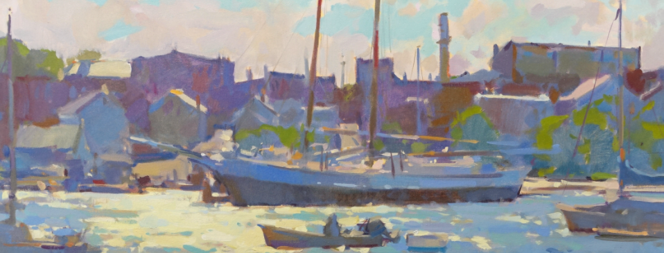
To achieve an atmosphere in a painting, you need to tighten up the relationships between values. Use more colours and values that are closer together. Correlated temperature shifts will become your best weapon. Your value passages must remain tight. Fewer values mean more colour and more temperature changes within those values. This is where it helps to have an overall dominant temperature in your piece. Is my painting warm or cool? Again this is where a good plot comes in. 70% warm / 30% cool? Or?… 70% cool to 30% warm. What’s your story? Have a wee gander at this Colin Page work. Let’s learn.

Loads of atmosphere here. Notice how all the colours sing and are harmonies. The harmonies come from close-knit values.
Look at it in black and white and you can see how close the values are.

Look at all the colours in the upper part of the painting, and yet in black and white, we see all the colour changes are close in value.


Here are a few more atmospheric paintings:

David Santiillanes.

Watercolour by Joesph Zbukvic. Again, notice the close relationships between values.

Edgar Payne keeping his values tight. This work has no value above a 5!

Carl Runguis. The value range in the speed goat painting stays above #5. (The darks on the antler are really just accents, not part of the value scheme.)

This Daniel Scott painting is high key with 70% cool to 30% warm
Here we have the same artist Quan Ho paintings with two paintings represented. One painting is dramatic (single light source and large value gap) and one is atmospheric (spilly light source and close values).


Dramatically direct light or looking at you through soft veils of atmosphere. The same artist uses two different methods.
So, when do we use these? These are just more tools to put in your toolbox to use whenever you want. Ask yourself, What is the concept of this painting? Does it call for drama? Maybe some atmosphere? What can I add to this work to set it out from the others? You get to decide.
Hope this helps keep those brushes swinging,
Your friend in art,
Doug.


Really interesting perspective on balancing drama and atmosphere in painting. It’s fascinating how subtle choices in color and composition can shift the entire mood. Check out Headway — learn more and get a comprehensive Audible review. This makes me want to experiment more with tone and contrast in my own work.
Great read on how drama and atmosphere shape the emotional impact of a painting! I especially enjoyed the discussion on balancing bold contrasts with subtle mood. This perspective really deepens appreciation for artistic choices. Also, I was curious how artists’ personal journeys like dana dokmanovich net worth influence their creative evolution and ambition in art.
Your generosity and kindness have truly made a difference in my life. Thank you from the bottom of my heart.
best iptv : Welcome to Best IPTV 4K, your number one destination for the best IPTV service available today. We bring you an exceptional 4K Ultra HD streaming experience, combining quality, reliability, and performance to redefine how you watch TV. With access to thousands of live channels, movies, and series from around the world, we make entertainment smarter, smoother, and sharper than ever before.
At Best IPTV 4K, our mission is simple — to provide you with a premium IPTV service that works flawlessly on all your devices. Whether you’re watching on a Smart TV, Android Box, Fire Stick, PC, tablet, or mobile, our advanced servers ensure zero buffering, stable connections, and crystal-clear visuals in both HD and 4K resolutions.. best iptv
tung tung tung…
monero miners monero miners
monero miners monero miners
monero miners monero miners
monero miners monero miners
monero miners monero miners
monero miners monero miners
etc mining etc mining